
Case Overview
My Role
UX Designer/Front-end DeveloperBackground
This redesign was part of an upper-level UI/UX class at Brown. For this project, we had to pick a recent startup from Y Combinator and attempt to design a prototype of an interface that would solve the startup's problem, but without looking at any of the startup's products. For our startup, we selected Tangia, a monetization platform for streamers that enables viewers to buy interactions that affect the game being streamed in real-time. For example, a viewer pays $15 to spawn a boss enemy, and it instantly appears in the streamer's Minecraft world. We read Tangia's vision on Y Combinator but did not view any of their designed interfaces before completing the project.Key Project Structure
- Group design sprint
- Low-fidelity re-design
- High-fidelity Figma Prototype
- Industry critique
- Usability Testing
- Final re-design
Key Project Outcome
A user-tested high-fidelity re-design of Tangia.Selecting a Startup
We had to pick a recent startup from Y Combinator and attempt to design a prototype of an interface that would solve the startup's problem, but without looking at any of the startup's products.
For our startup, we selected Tangia, a monetization platform for streamers that enables viewers to buy interactions that affect the game being streamed in real time. For example, a viewer pays $15 to spawn a boss enemy, and it instantly appears in the streamer's Minecraft world.
We read Tangia's vision on Y Combinator, but did not view any of their designed interfaces before completing the project.
Sketching & Wireframing
Pre-Design Thinking
Tangia affects both the viewers and the streamers. Because we would expect the viewers and the streamers to see two very different interfaces, we decided to focus solely upon the interface for viewers. We sketched a variety of possible interfaces, all of which were intended for desktop.
Sketching
We explored several design alternatives in order to imagine what Tangia might look like.
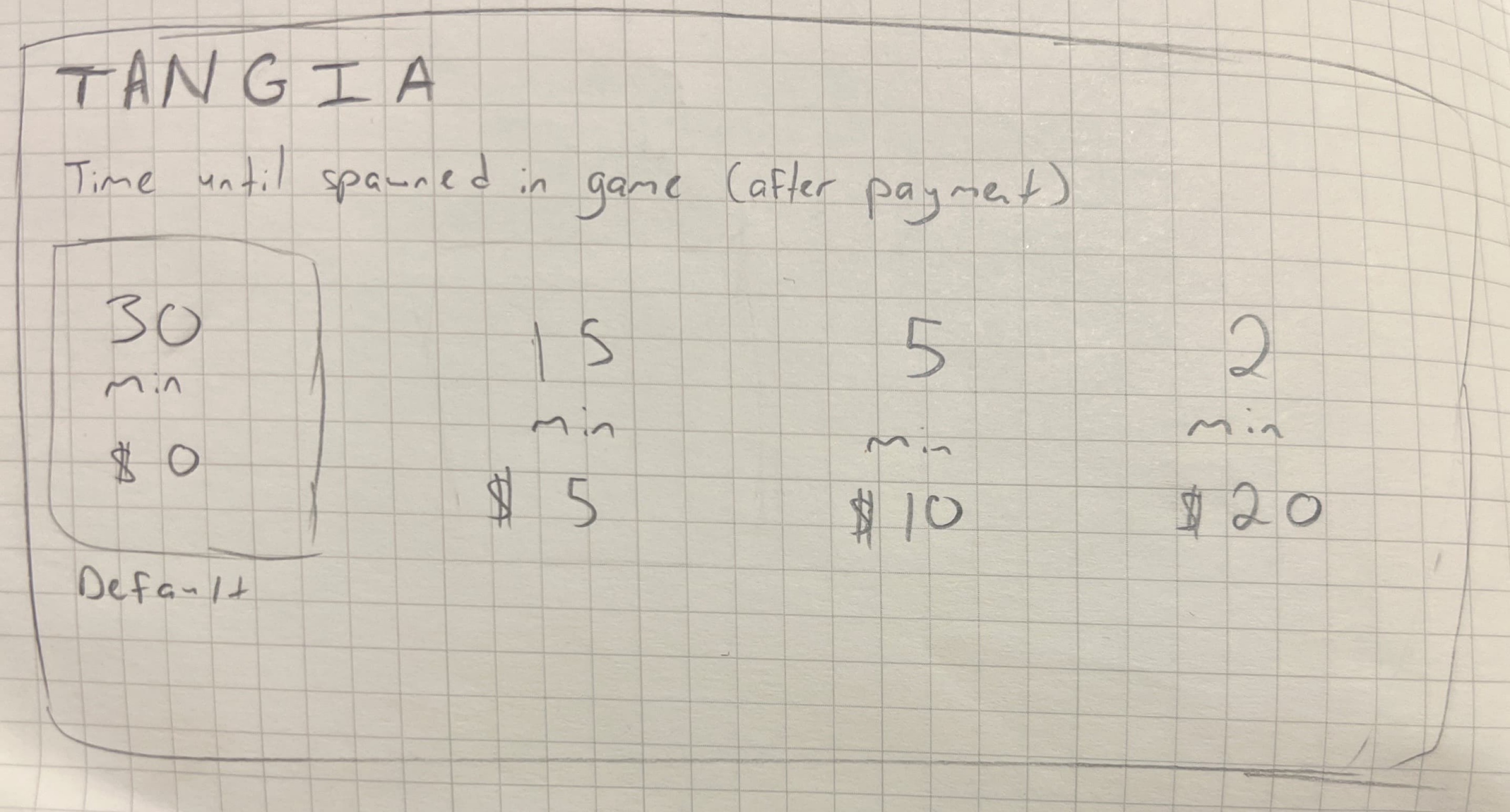
Tangia envisioned as a standalone streaming site integrated with streaming servies to both interact with and watch a stream (My Sketch).
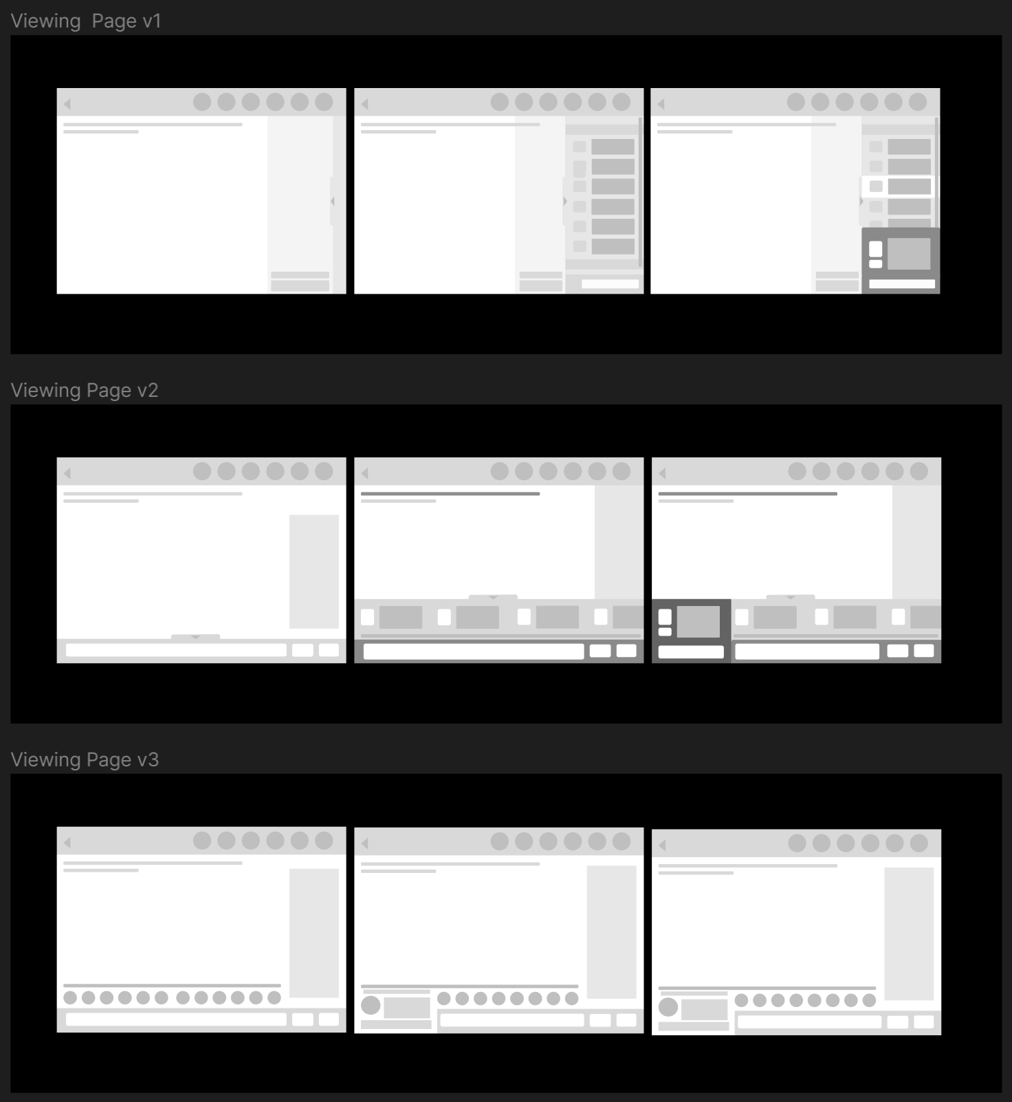
- Top: vertical scrolling and item checkout selection with a pop-out tab
- Middle: Horizontal scrolling with a checkout pop-out tab
- Bottom: Horizontal scrolling with horizontal expanding tab
Tangia envisioned as a standalone website that will accompany other streaming services (such as Twitch, YouTube, etc).
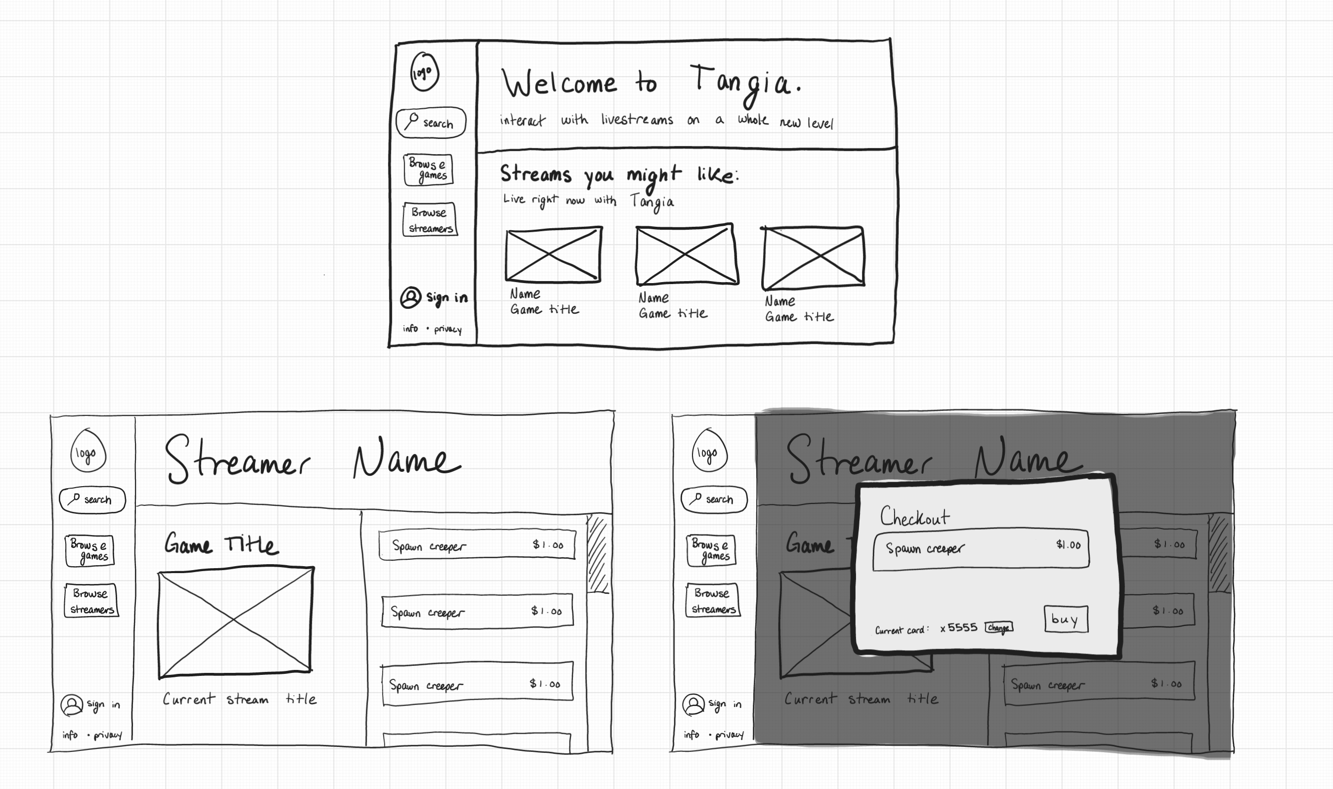
- Top: home page with a welcome message, recommended streams, and search/browsing options in the left navigation bar
- Bottom Left: streamer's page with a preview of their stream and scrollable content of the purchasable interactions. The navigation bar from the home page remains.
- Bottom Right: built on the streamer's page, the checkout page appears like a pop-up that blocks the rest of the screen while the user purchases the interaction.
Tangia envisioned as an embedded feature on a streaming service such as Twitch.


Tangia envisioned as a standalone streaming site integrated with streaming servies to both interact with and watch a stream.
Combining Ideas into a Wireframe
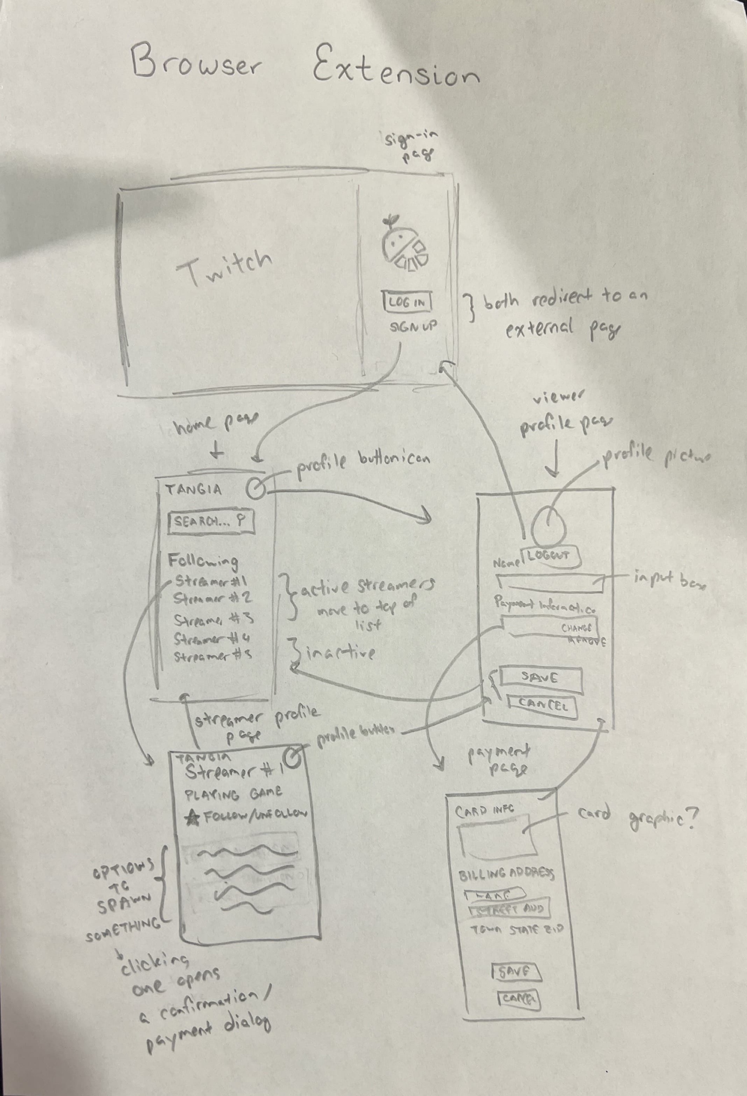
After a group design sprint, we took the best elements of each sketch to create one cohesive wireframe for a standalone interface. There were many possible ways for Tangia to exist (such as a feature embedded in streaming services or a browser extension), but we decided to move forward envisioning Tangia as a standalone site.
This final wireframe incorporated ideas from all of our sketches.
- From the browser extension, we took the sign-in page and navigation bar formats.
- From the embedded sketch, we took the idea of a “interaction delay” for purchasable items and the grouping of purchasable items into visually distinct boxes.
- From the standalone accompanying site, we took the “recommended streams” on the home page and the design of the home page in general.
- From the standalone site integrated with streaming services, we took vertical scrolling and a banner for the active launch
Mockups
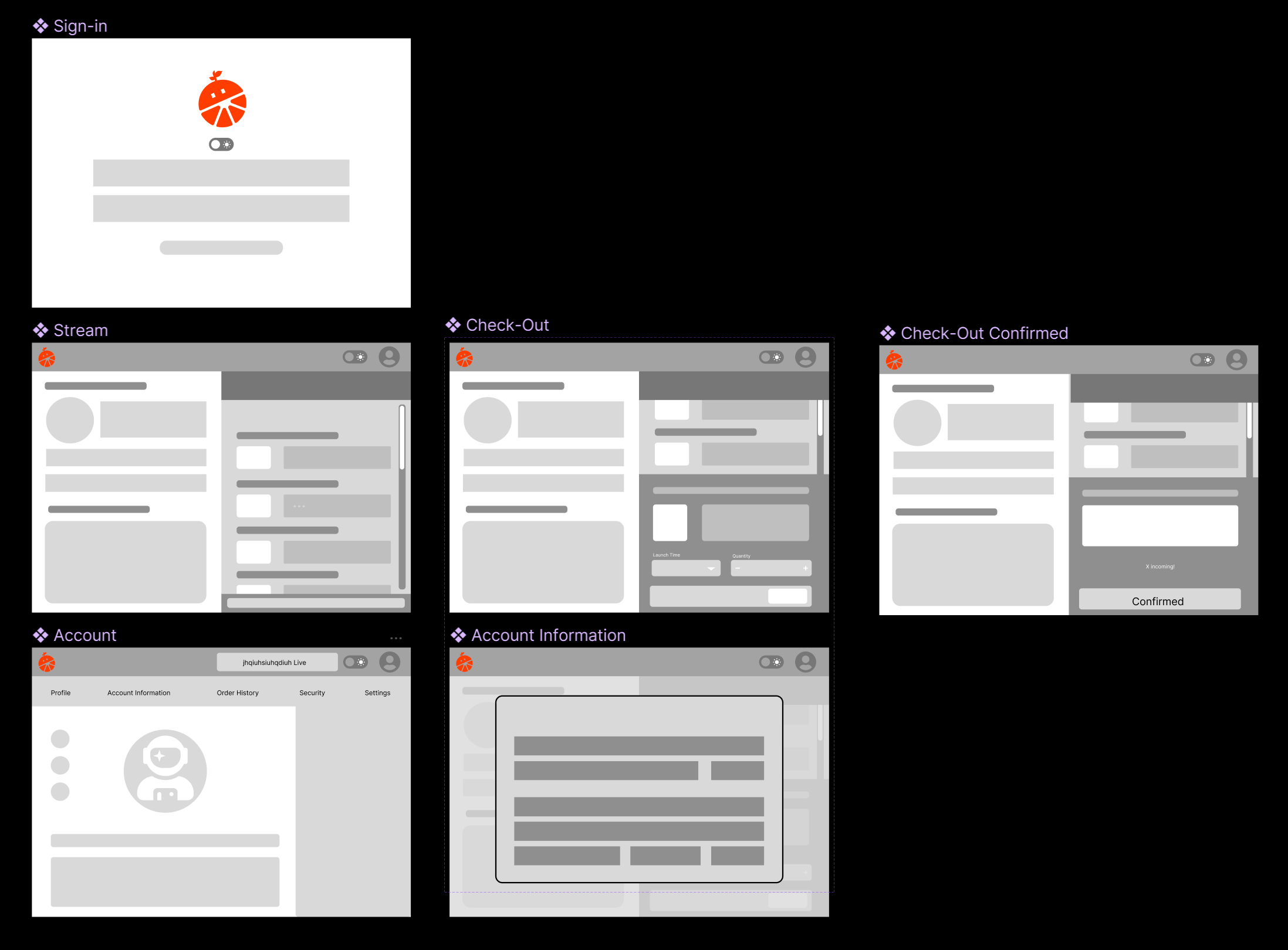
Interactive High-Fidelity Mockup
Next, we created an interactive high-fidelity prototype, which is an enhanced version of the combined wireframe, populated with sample realistic content. Feel free to interact with the prototype and navigate through the different screens.
Mockup Critique
After designing our high-fidelity prototype, we shared with 30 other people and received feedback and critiques from them. The critiques and the changes we implemented in response to the critiques are listed below.
| Critique Received | Change Implemented |
|---|---|
| Provide reassurance for users in regards to security for payment | Added a lock icon next to the payment information in account settings |
| Search bar in right rail is confusing | Removed the search bar from the right rail |
| Badges had unclear meaning | Removed badges from account page completely |
| Dark mode takes up too much space on the nav bar | Removed dark mode from the nav bar and placed it in the account page and only kept it in sign in |
| Breathability | Removed the search bar from the right rail, reduced size of top nav bar, reduced right rail to ⅔ the original size |
| Unclear color hierarchy. Colors don't have consistent meaning in regards to their function. | Adhered to a consistent visual style so that button colors and background colors, etc are all consistently used throughout the different pages of the site. Things that looked similar to buttons were changed to avoid confusion. |
| Despite the importance of the stream, it was relatively small on the page. Unable to see the chat | Made stream bigger |
| Unclear if the streaming page was a page for a specific streamer or the user's profile page. Confused by the big logo with username with the streamer name. Unsure if that is their name or the streamer's name | Added "[streamer name] is streaming [game name]"" to clarify that the streaming page is the streaming page and made the name and image smaller |
| Would this have compatibility with other streaming platforms like youtube or facebook? People felt main purpose of Tangia was more so a streaming platform rather than a support to make streams more interactive | Added a return to Twitch button and the location of stream is now indicated under the description of streams |
| In-app currency | Replaced money with tangerines (like bits on Twitch) |
| Confused if users have the ability to switch which streamer they are watching within Tangia | Added home page with multiple suggested / previously watched streamers and a search bar so that users can search for different streamers. This also aids in site navigation. |
We modified our previous prototype, which you can interact with here.
Design choices to achieve the original goals of the startup:
- Including a "dark mode" appeals to the intended audience of Tangia, which is gamers who frequently prefer a dark mode.
- Centralized the purchasable interactions to put them higher in the visual hierarchy.
- Heavily featured stream spawn stats and recent interactions from other users to both emphasize and engage users primarily in the form of in-game interactions.
- Gamified purchasing using Tangerines (🍊) to incentivize spending for the intended audience of gamers.
- We chose to always have a method on each page to directly return to the most recent stream the user has spawned an item for.
- The checkout window is unintrusive and doesn't obscure the main functionality of the page, which is browsing interactions and watching the livestream.
- After making a purchase, the interaction appears in the top bar; this maintains engagement by keeping interactions in view and in mind before they spawn in stream.
- The home page increases engagement with streamers by showing recommendations for new streams that the viewer might not have seen before.
User Testing
Assigned Task
Imagine you are a viewer of the Twitch streamer thejocraft_live. Buy a "Creeper Mob Spawn!" interaction and confirm the purchase in your order history. Please think aloud as you perform the task. You will be interacting with a Figma prototype and not a fully functional website.
Testing Instructions via UserTesting.com
Listed here are the instructions given to users while testing the prototype.
- Choose between light or dark mode, and sign in please.
- Do not click on anything yet please! Describe what you are seeing on the home page. How would you interact with this page?
- Please proceed to thejocraft_live's stream page, and describe what you are seeing on the page and what you would do.
- Please purchase a "Creeper Mob Spawn!" interaction for thejocraft_live's stream. Please remember to describe your thought process as you work through this task!
- How do you know that your purchase registered?
- If you have not yet, please confirm your purchase in your order history.
- How would you navigate to the home page?
Analysis of Results
Expectations
We expect the home page and checkout process to be intuitive and smooth.
We primarily think that the task of navigating to order history might be more difficult for users.
In addition, we suspect that subjects may be confused about the overall purpose of the site (such as what the embedded Twitch stream is for).
Observations and Errors
We had three users test our site: Vikingevaluator, Tubbington, and Sessa925.
"I would be able to spawn certain types of, probably, characters in the game to make it more enjoyable and maybe to participate in the game. This is very interesting, by the way. The viewer is not only watching the scene but also participating in the gameplay. This is very nice."
- Vikingevaluator did not make it to the order history but did everything else; Tubbington did everything; Sessa925 did not complete an order but did everything else.
- Tubbington initially thought that the images on the homepage led to clips of previous streams rather than previous streams. Sessa925 was unsure why she would want to go back to a stream she recently watched.
- Vikingevaluator did not make it to the order history as we thought might happen.
- Tubbington first clicked the watch history in the account to attempt to go back to home. His second option was correctly the Tangia logo. He later said that clicking the logo was self-explanatory.
- Sessa925 could not click on the scroll bar and scroll, which is an unfortunate limitation of Figma.
Possible Improvements
The issue which Sessa925 ran into seems the most important to resolve, but it is not actually something we can fix because of Figma itself.
To clarify Tubbington and Sessa925's critiques, we would change the wording of "Recently Watched" to be "Current Stream" instead.
Two possible solutions to address Vikingevaluator's confusion: we could either put an exclamation mark on the profile icon to indicate that attention is warranted on the profile page, or we could add a bell icon with a number that indicates how many notifications the user has, including purchase notifications.
Contacting the Startup
To round out the project, we contacted the Tangia team and shared our project with them. Here's a copy of our email.
Hello!
We are sleepyotter, roundthings, mawkishmeerkat, and shyworm-our students from Brown University taking a
class in UI / UX! We are concluding a group project in which we had to pick a recent startup from Y
Combinator and attempt to design a prototype of an interface that would solve the startup's problem, but
without looking at any of the startup's products. We were intrigued by the premise of your
company—allowing viewers to interact with their favorite streamers—so we chose to tackle a prototype for
Tangia! We decided to create a standalone website interface for viewers. Specifically, we created a
prototype in Figma that allows a viewer to log in, navigate to a favorite streamer, and spawn creepers
into the game! If you are interested, we have shared the Figma prototype with you. We can also share
with you the whole writeup for our project if you would like! We would love to hear your thoughts on
what we created!
Warmly,
sleepyotter, roundthings, mawkishmeerkat, and shyworm