
Case Overview
My Role
UX Designer/Front-end DeveloperBackground
Yan’s Cuisine is a popular local restaurant near Brown University known for its quick and cheap takeout (a personal favorite). Students often order directly from the restaurant's website, however, new users often find it challenging to navigate. This project will perform a heuristic analysis of Yan Cusine’s landing page and navigation and propose a new layout to allow better customers to explore the menu and order their meals more efficientlyKey Project Structure
- Heuristic Analysis
- Accessibility Anaylsis
- Wireframing
- High-Fidelity Design
- Responsive Website
Key Project Outcome
A responsive, high-fidelity re-design of Yan's Cuisine online menu.Heuristic Analysis
Current Yan's Site
Shown below is the landing page/ordering page of Yan's main website. Using Nielsen Norman's Heuristics guidelines and static testing, I identified 3 main areas of concern with this current webpage.
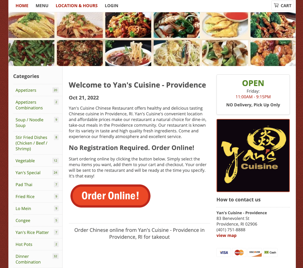
Efficiency
- Text is small and hard to parse effectively
- Store hours and pick-up are minimized
- Dishes are categorized too specificly
Learnability
- Button CTAs are unclear in what they lead to
- Redundant information gives new users more information to parse through, irrelevant to their main goal
Memorability
- Multiple CTAs indicate multiple flows to order food, which can lead to confusion for returning users trying to remember how to interact with the website
W.A.V.E Analysis
In terms of accessibility, there is only one main error identified by the WAVE tool which is that the search button is lacking form labels, meaning those who are using certain accessibility devices may not be able to evaluate that specific element. In addition, another concern flagged by WAVE is the type size of all the dish categories, which are all presented on the webpage with fonts 10px or smaller and could make it difficult for hard-of-sight users to parse through the menu.
Wireframes
I first approached the challenge of redesigning Yan's online menu with two main issues in mind: the
aforementioned usability findings, and to make the new design responsive
across desktop, tablet, and mobile screen sizes. In particular, since the original website prioritized
online ordering
and menu parsing, I expanded the menu.
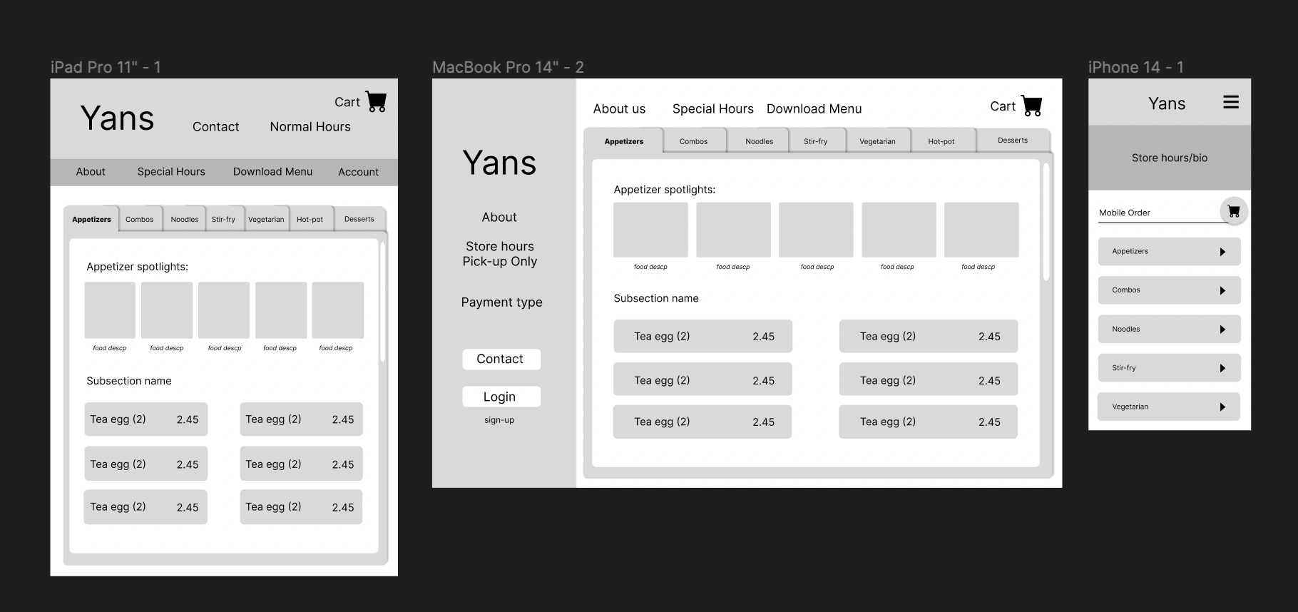
The original website prioritized online ordering and menu parsing, however the layout was too cramped to be effective, therefore I expanded the menu. Additionally, since Yan’s is pick-up only, other high-priority information would be not only the hours but also the location, which was highlighted in a sidebar. Lastly, because in the original website, clicking into a category would obscure other menu options, I opted to go with a horizontal tabbed menu for which there is a nested vertical scroll page -therefore you can both maintain your categorical location in the menu while also looking at specific items.
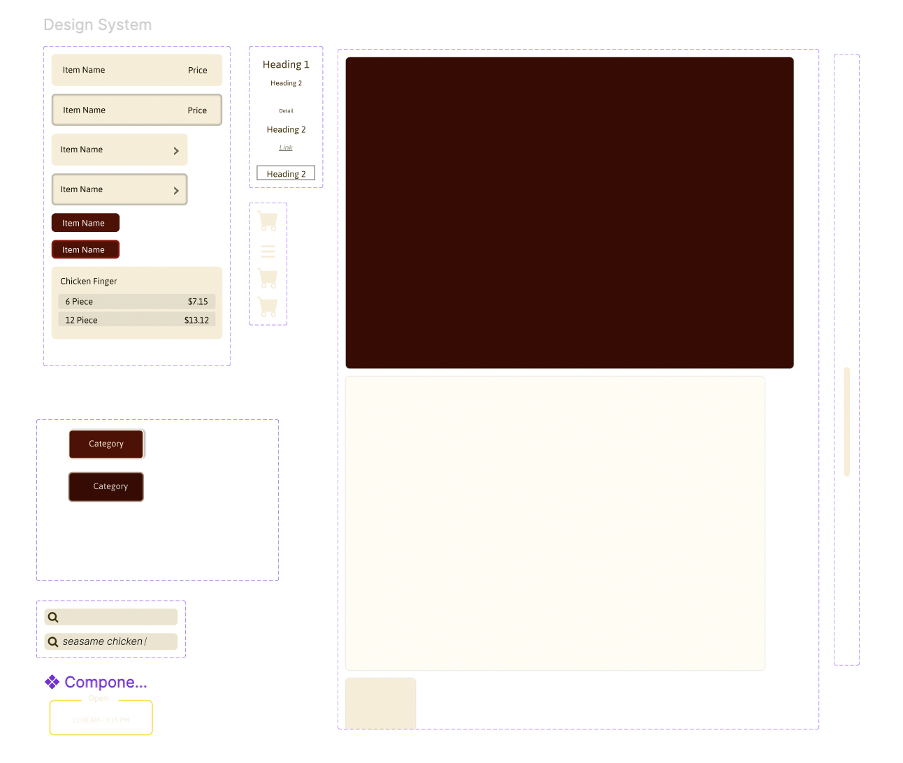
High-Fidelity
Design System
I first appproched creating my hi-fi design by with creating a design system and base components identified in my lo-fi wireframe.
Completed Hi-Fi
After I created my design system, I built out the 3 main viewing ratios. Throughout this process, I also annotated the page with consideration of how sections would translate into html/css/javascript
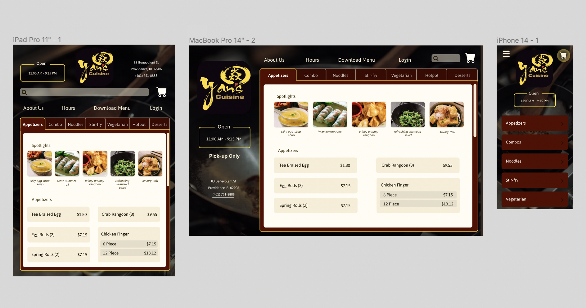
Static HTML Webpage
Using html/css and the hi-fi Figma annotations, I coded the the final site and launched it.